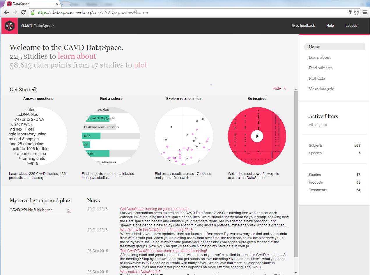
Quick links on the home page – Now it's even easier to get started!
Need to know what assays were run in a study? Want to find data on subjects who received a protein-based vaccine? Or just want to take a quick look at responses at a given time point? The quick links will take you where you need to go. And don't forget the Getting Started video. It's a great place to begin your first session. You'll learn about the key features of DataSpace, hear about common use cases, and get inspired!
A new way to look at time
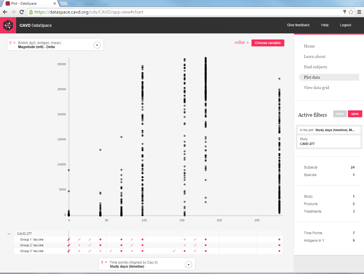
When you plot assay results against time (e.g. study day) on the X-axis, you'll see the timeline of vaccination and follow up visits for each treatment group beneath the plot. This can be a handy way to help you identify which time points are most relevant for your question.
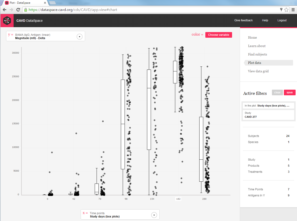
 Now there's another way to look at time. We've added a new set of timing variables to allow you to plot time points as categorical variables. The result is individual boxplots for each visit in Plot, giving you a better visual comparison of responses between visits.

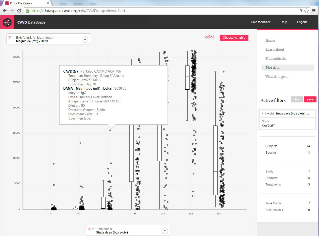
New tooltip shows you details about the data
We've created a tooltip to provide better visibility into your data in Plot. Click on a datapoint to see the details about that datapoint, including the study, subject ID, study day, and value of the measure being plotted. It even shows what assay dimensions (antigens, dilutions, speciment types, etc) are associated with that datapoint – important elements to help you better understand the data.


