Check out the latest improvements to the mAb reports!
Over the last year, we've been working with investigators and developers to redesign the data visualizations for monoclonal antibody data in the DataSpace. We've added a new magnitude-breadth curve visualization and improved the functionality of existing reports by offering more interactivity, and increasing the number of mAb-virus combinations and neutralization curves per plot. All plotting is now performed using JavaScript and the D3 JavaScript library which allows for quicker rendering time and more flexibility in how plot elements appear in the application. Figure 1 shows the main features of the Monoclonal antibodies section, including the mAb grid and the MAb Info pane.
Figure 1: Main features of the Monoclonal antibody section

Figure 2 shows you how to select mAbs to include in your visualizations. Once you've selected the mAbs you want, click the Visualize Data button to view four different reports:
- Neutralization curves
- Neutralization curve grid
- Magnitude-breadth curves
- Heatmap.
Figure 2: Selecting mAbs for visualizations

Each report has a tab.
Neutralization Curves – The neutralization curves report (Figures 3 and 4) is similar to what was in the original version except there is no cap in place to limit how many mAb-virus combinations can be viewed at once. MAbs selected in the grid can be seen in a drop-down menu where selecting a single mAb draws the neutralization curves for the viruses tested against that mAb. The legend is now interactive, where hovering over a virus in the legend makes that curve pop in the plot, displays the discreet dilution values used to make the curve, and the error bars associated with the replicates for each dilution. A table below the plot provides details about each curve, including titer values and fit parameters.
Figure 3: Neutralization curve report

Figure 4: Neutralization curve report

Neutralization Grid – The neutralization curve grid (Figure 5) uses the same curve data used in the neutralization curves report, where all curves for all mAbs and viruses selected in the mAb grid are shown at once in a tabular, grid-like format.
Figure 5: Neutralization curve grid report

Magnitude-breadth – The magnitude-breadth curves report (Figures 6 and 7) allows users to select groups of mAbs that were tested against the same panel of viruses, and displays those groups in plots that show the percent cumulative coverage (breadth) of a given mAb at different concentrations (magnitude). When a group is selected, each mAb is represented by a curve (and color) in the plot and datapoints on the curve represent different viruses. Hovering over a virus name will show the location of the virus datapoint on each mAb’s magnitude-breadth curve.
Figure 6: Magnitude-breadth curve report

Figure 7: Magnitude-breadth curve report

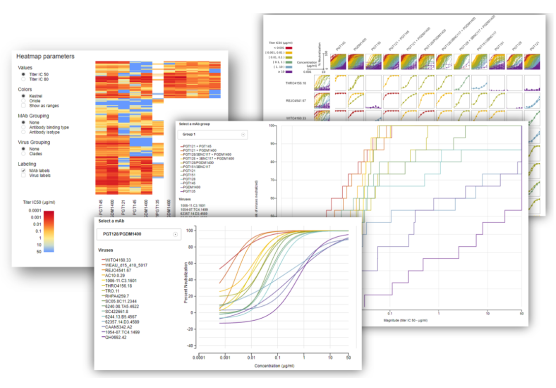
Heatmap – Finally, the new heatmap report (Figure 8) is parameterized so that several features can be toggled. The heatmap can be set to represent titer IC50 or IC80 values as color. The colors can be toggled to show one of two different color ramps, as well as the option to set the color ramp to be shown as a continuous scale or as ranges. The mAbs can be grouped by antibody binding type or isotype, and viruses can be grouped by clade. The mAb and virus names can also be turned on or off, optimizing the dimensions of the plot as needed.
Figure 8: Titer heatmap report
