Treatment
What's new in the DataSpace - February 2016
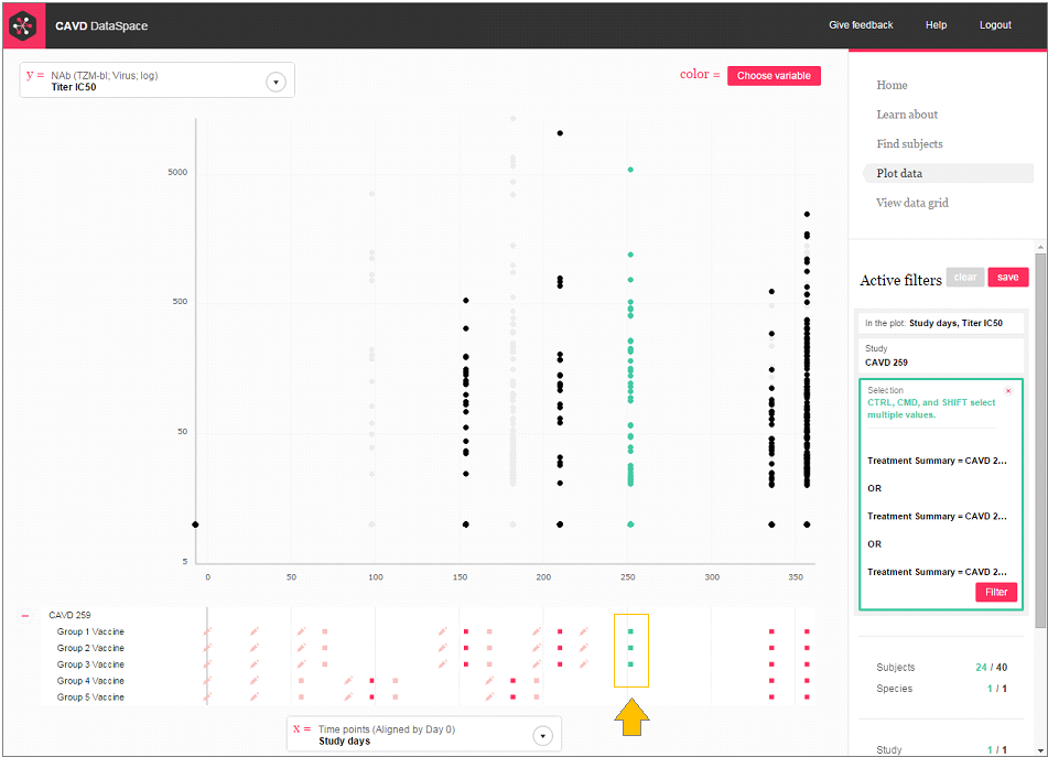
When you're plotting assay data over time, the red icons below the plot show you all the study visits, including at which time points vaccinations and challenges were given for each of the treatment groups. Now, you can quickly see which time points have data in your plot (the time points with data are a darker red). You can even click on the icons at the bottom of your plot to select and filter the groups and time points you want. You asked for 'em, you got 'em. We added over 160… Read more