We've added several new updates since our launch in December.
Try two new ways to find and select data from within your plot.
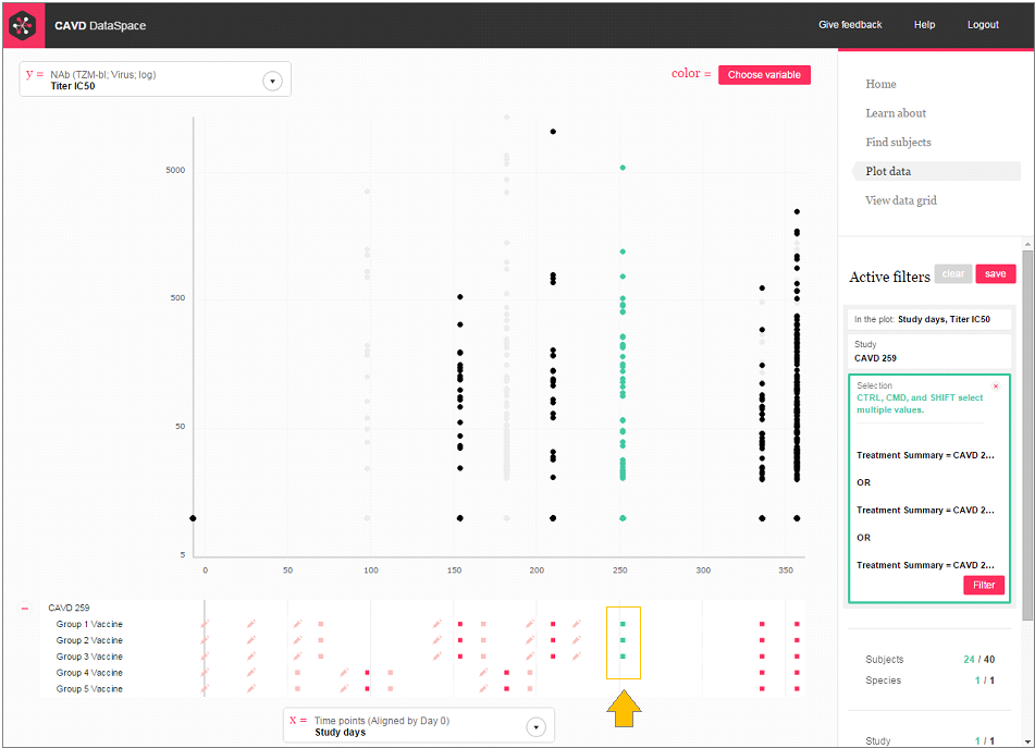
When you're plotting assay data over time, the red icons below the plot show you all the study visits, including at which time points vaccinations and challenges were given for each of the treatment groups.
Now, you can quickly see which time points have data in your plot (the time points with data are a darker red). You can even click on the icons at the bottom of your plot to select and filter the groups and time points you want.
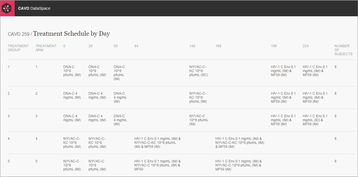
More Treatment Schemas!
You asked for 'em, you got 'em. We added over 160 treatment schemas! Now you can access treatment schemas for all CAVD studies.


