Plot
New mAb magnitude-breadth reports

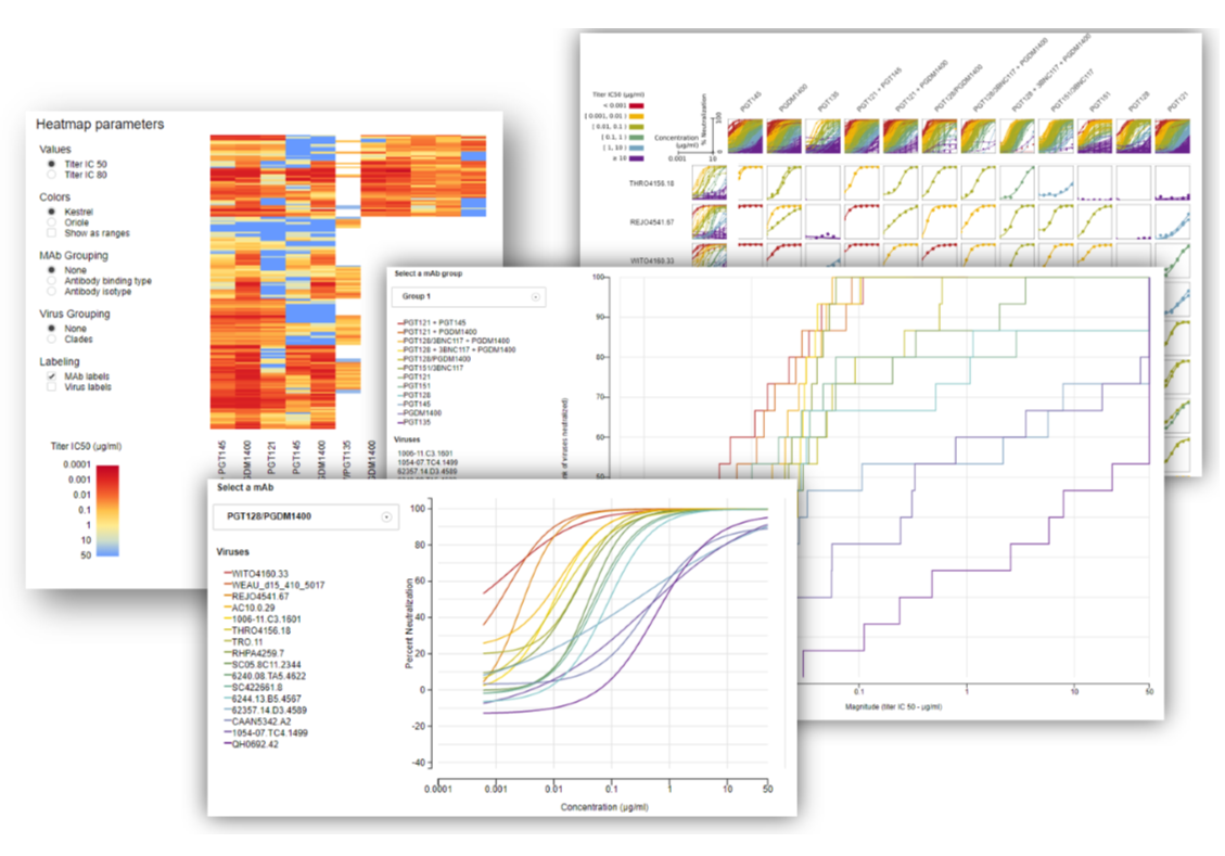
Over the last year, we've been working with investigators and developers to redesign the data visualizations for monoclonal antibody data in the DataSpace. We've added a new magnitude-breadth curve visualization and improved the functionality of existing reports by offering more interactivity, and increasing the number of mAb-virus combinations and neutralization curves per plot. All plotting is now performed using JavaScript and the D3 JavaScript library… Read more
What's new in the DataSpace - May 2016
When plotting assay data over time (e.g. by study days, weeks, or months), you have the option of plotting time as a continuous or categorical variable. Plotting time as a continuous variable shows a simple, clean distribution of data over time, whereas, plotting time as a categorical variable results in individual boxplots for each visit in Plot, which can make it easier to compare responses between visits. Now you'll see the study timeline (the icons showing the timing… Read more
What's new in the DataSpace - April 2016

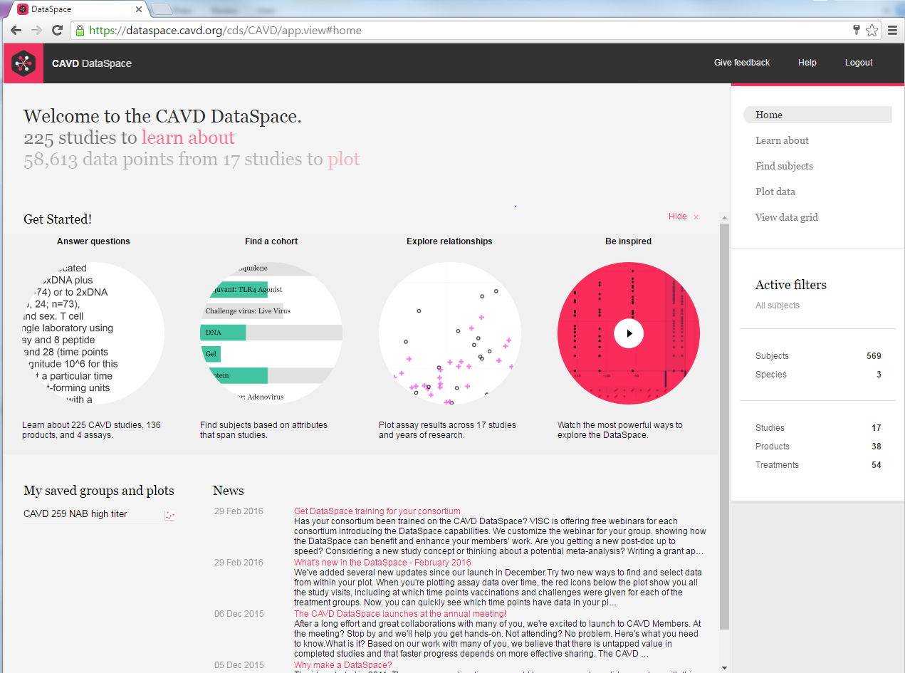
Need to know what assays were run in a study? Want to find data on subjects who received a protein-based vaccine? Or just want to take a quick look at responses at a given time point? The quick links will take you where you need to go. And don't forget the Getting Started video. It's a great place to begin your first session. You'll learn about the key features of DataSpace, hear about common use cases, and get inspired! When you plot assay results against time (e.g. study day) on the… Read more
What's new in the DataSpace - February 2016

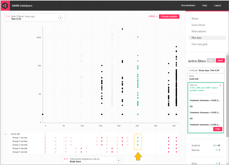
When you're plotting assay data over time, the red icons below the plot show you all the study visits, including at which time points vaccinations and challenges were given for each of the treatment groups. Now, you can quickly see which time points have data in your plot (the time points with data are a darker red). You can even click on the icons at the bottom of your plot to select and filter the groups and time points you want. You asked for 'em, you got 'em. We added over 160… Read more
